ÉCOLE DU LOUVRE, LOUVRE, PARIS
PARTIAL DESIGN OF THE ÉCOLE DU LOUVRE, LOUVRE, PARIS
CLIENT
OPPIC
SIZE
1300m2
PROGRAM
Library, recherche center, offices, digital cafétéria, furnitures
BUDGET
1,7 M€ HT
ARCHITECTS
Atelier Krauss
ENGINEERING
Sibat, Deltexplan OPC
STATUS
Closed competition 2020
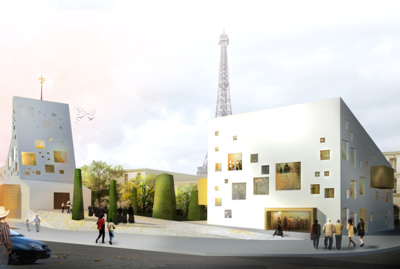
Redesigning the Louvre School is a rare opportunity for us to question the place of the Louvre Palace’s architecture within its teaching. At a time when digital technology has become unavoidable, the prestigious Parisian school is more than ever confronted with an evolution of its uses and customs. It is a matter of affirming its role as an educational catalyst by placing the library at the heart of student life.
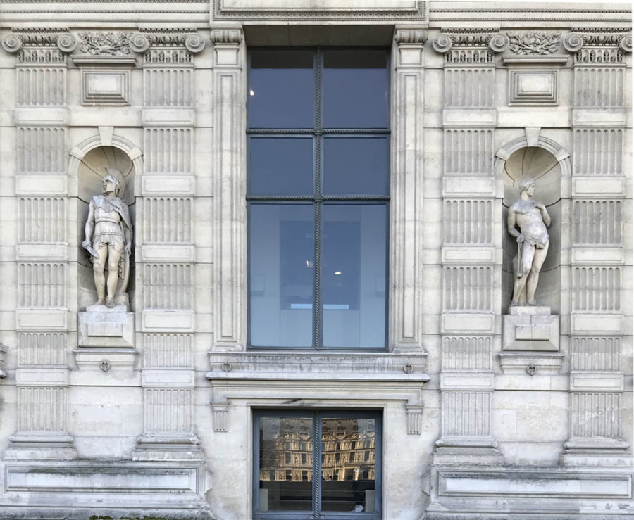
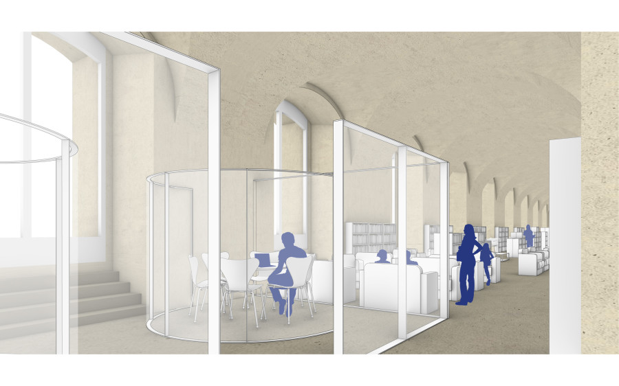
Very short completion delay combined with conditions of site is in use bring us to prefer a minimalist design approach to reveal the original volumes.
This choice to return to primary drawing leads us to the development of a landscape project based on the disappearance of boundaries not only between disciplines, and also between different publics (teachers, researchers, students and administrators).
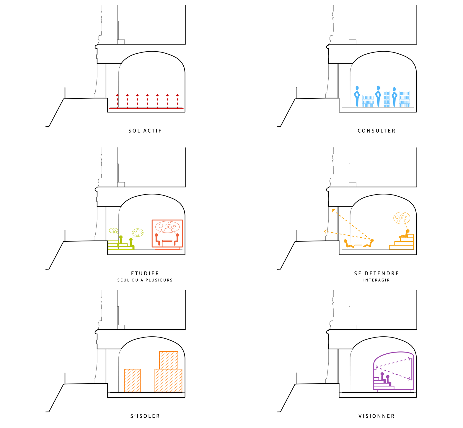
The library becomes a territory of learning, modular and digital, whose scenography allows a customizable use, either individual or collective.
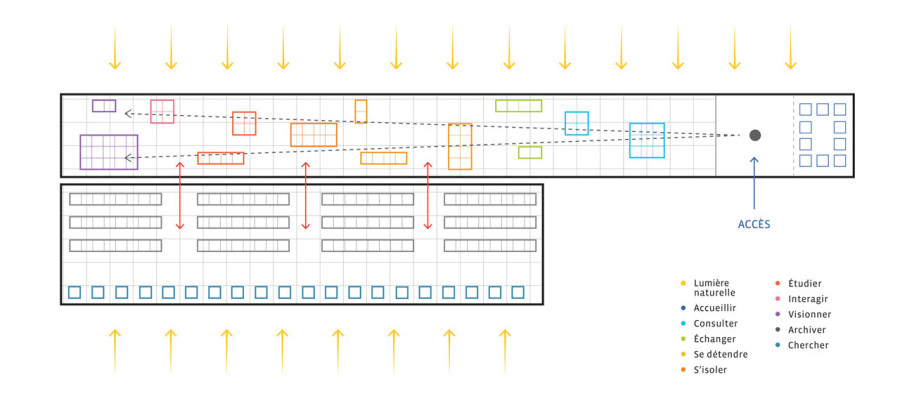
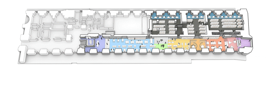
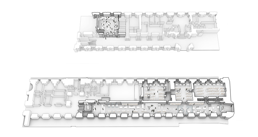
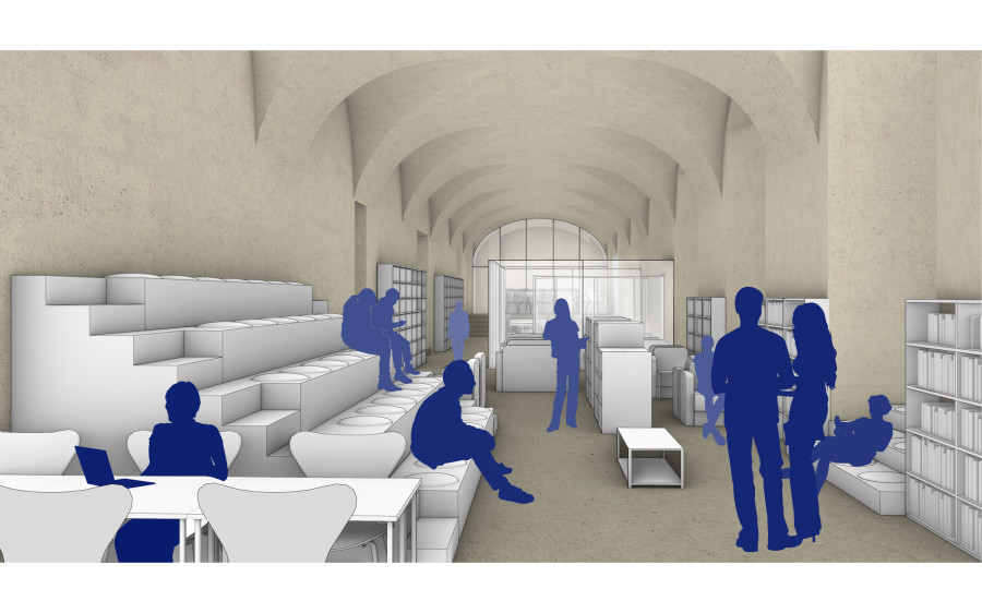
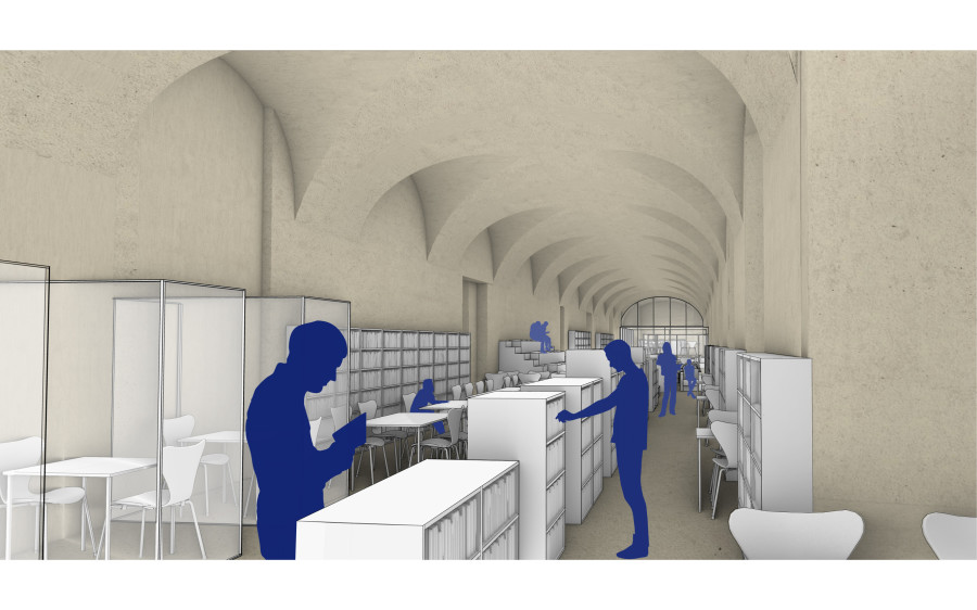
A large variety of work and reading spaces are available successively: consult, study, research, listen, watch. Others, more informal and dedicated to exchange and relaxation, are organized around a main central area with fixed bleachers.
This topography, combined with ergonomic furniture and low central shelves, contributes actively to the visual clarity of the space and the ambient acoustic comfort.
Larger book storages are disposed on the opposite side in order to clear the façades. On the Seine side, additional individual working and reading spaces benefits of greater privacy and natural lighting. This proposal aims to increase the library’s reception capacity while giving the user the desire to be there and the comfort to stay there.
To facilitate the access to the library from the ground floor, the cafeteria is designed as an antechamber. It becomes a one-stop counter, a place of exchange and sharing, where the visitor finds directly all the practical information concerning the library use in real time. The furniture is designed for easier and more flexible use.
- Categories:
- Likes:
 En
En  Fr
Fr 


